Welcome to The UX design page for the Lesson Spot: The Hottest Spot for Online Music Lessons!
Research
Introduction
Music lessons are a great way to expand your knowledge and help develop creativity and confidence.
In today’s world, people are always complaining about time, money, and convenience issues that prevent them from reaching their goals. Luckily, there are solutions available! Through a clean, fun and user friendly interface, The Lesson Spot music lessons website will provide users with a convenient and less pricey option for learning a new skill, or strengthening skills they already have.
Screener Survey Questions
1. How Old Are You?
2. Where do you currently live?
3. Do you play any musical instruments or sing?
4. Rate your musical ability on a scale of 0-10.
5. Have you ever thought about taking music lessons?
6. If yes or maybe, what kept you from taking those lessons?
7. If there was a way to take music lessons with qualified teachers from the comfort of your own home, would that be of interest to you?
8. If yes or maybe, how much would you be willing to pay for one half hour of music lessons?
Analysis
Out of the 20 people who answered the survey, nearly half were ages 22-24, about 30% were 35-46, 10% were 56-70, 15% were 17-22 and 5% each were 47-55 and 0-10. They lived in widely varied types of locations, from rural to urban, mostly in the US, but some elsewhere.
It was fairly universal amongst the participants, save one, that they were either interested in taking music lessons, or maybe would think about it. Similarly, most of them would also be interested in taking lessons from home, although they were a little less sure about that. Several already played something, and a full 45% said they already sing.
The average price they were willing to pay was around $25.
Post-Survey Interview
I interviewed two survey takers in the 35-46 range and two in the 56-70 range. All the respondents have played some instrument in the past, but most only tinker around with it now. For the most part, they were also all ambiguous about wanting to take music lessons presently.
Music has been significant in all of their lives, although their answers for why vary wildly from: “it was the soundtrack to my life”, to “when I’m singing I feel the world drop away” to, “it’s one of the things that has kept my sanity in this crazy world”.
All of them had some degree of musical training, with varying degrees of success. Generally they would all like to take lessons in something, but time, money and priorities get in the way.
Online music lessons seem like a good idea to them, but the two older respondents said if they were going to bother with lessons, they’d probably just go out and get them somewhere.
All were interested in a group learning environment, and all like to learn new things in general. Half said they tried to do so often, the other half said, some variation of as “often as I can”. This tied in directly with budgetary concerns, as those who said they often tried to learn new things had more money to spare than the others.
All preferred to buy some things online and some things in person. Mostly clothes and groceries, but not produce or home furnishings.
Regarding doing things at home online vs. going out one respondent said:
“There’s an experience in going out, it can be a social gathering that you don’t get on the computer”.
That person also thought that this could apply to lessons and perhaps dampen his enthusiasm. Another stated that some things can be bought sight unseen, and some need to be touched, smelled, tasted. He thought this probably isn’t an issue with online music lessons, but that maybe taking them somewhere cool like an old music school or a venerable university would make the experience more grand and exciting. The other two respondents were more interested in time and convenience, and thought that applied to music lessons as well.
Half of the respondents had taken an online class and half hadn’t. Those who had, reported having a positive experience, and both enjoyed learning at their own pace. One had even taught many online classes and preferred that to teaching in person because: “I can do it in my pajamas unless I’m taping a lesson/ having a skype, then I have to change my shirt.”
Those who hadn't, had the expectation that it would be convenient and allow them to spend more time at home. One of the older participants lives far away from things, but doesn’t really mind driving, as he is semi-retired. The younger has a young child and thinks going out to lessons would be nearly impossible. This way, he could just close the door for a half hour and hope no one screams at him while he’s learning.
Overall, there was interest in online music lessons, but they would have to be tailored so that many different types of people can use and enjoy the process. Most people seem to be rather ambivalent about it, so enthusiastic recruitment and incentives might be necessary. Most adults also start with a basic-intermediate knowledge of what they plan to learn. Finally, I think learning a little bit more about people’s drive to better themselves, and how far they take that, could be helpful.
Empathy Maps and Personas
Below are empathy maps for, and descriptions of, the fictional user personas created from the research above. The first, Jack Daddington, is a father in his mid-thirties, and the other, Jill Grammar, is a Gramma in her late 60's. While they have differing concerns, both are interested in doing something for themselves, such as taking music lessons. The personas are described in detail below, and the empathy maps represent what these characters think and feel, hear, see and say and do, as well as their frustrations and goals.
User Stories
The user stories listed below were created in order to come up with what the Minimum Viable Product (MVP) would be, which is and important component to the successful iteration/validation cycle of Lean UX design.
Card Sort and Sitemap
The full results of the card sort exercise can be viewed here.
The card sort exercise for this site began with recruiting users from a large pool of potential customers. Among the 4 final participants, there were no categories that were named exactly the same, although, several were similar across the board like “My account info/my profile”, “profile” and “account” or “instructors”, “teachers” and “find a teacher”. The "information media" section I’d envisioned threw a few people for a loop, as no one, except perhaps user 4, truly went in the direction I’d envisioned. This then led me to then lump that section more closely in with all of the other content, rather than make it a completely separate one, so that users understand that this whole page is here for some type of information. Additionally, I discovered that calling it "Resources" would make a big difference in keeping that clear.
Overall the sense that the music theory went together and the instruments and the teacher’s info went together, respectively, seemed clear to the participants. However, the instruments weren’t simply listed, but rather part of the information section, which showed me that it needed to be clearer on the site.
The results were what was expected and helped inform the sitemap. The sitemap subsequently created using those results is below:
and this is the final sitemap created after several more steps in the iterative process:
WireFrames
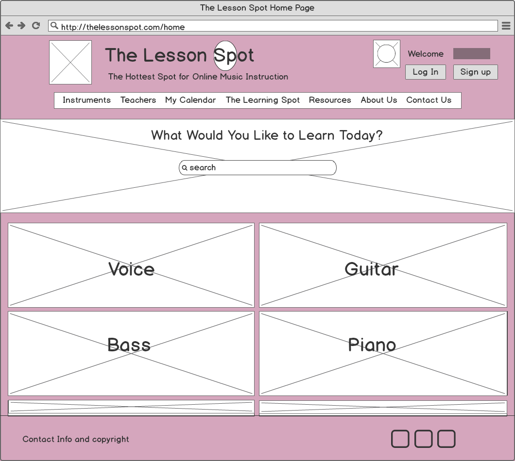
Below are some of the most important pages in the site, in low-fidelity wireframe form.

User Flows
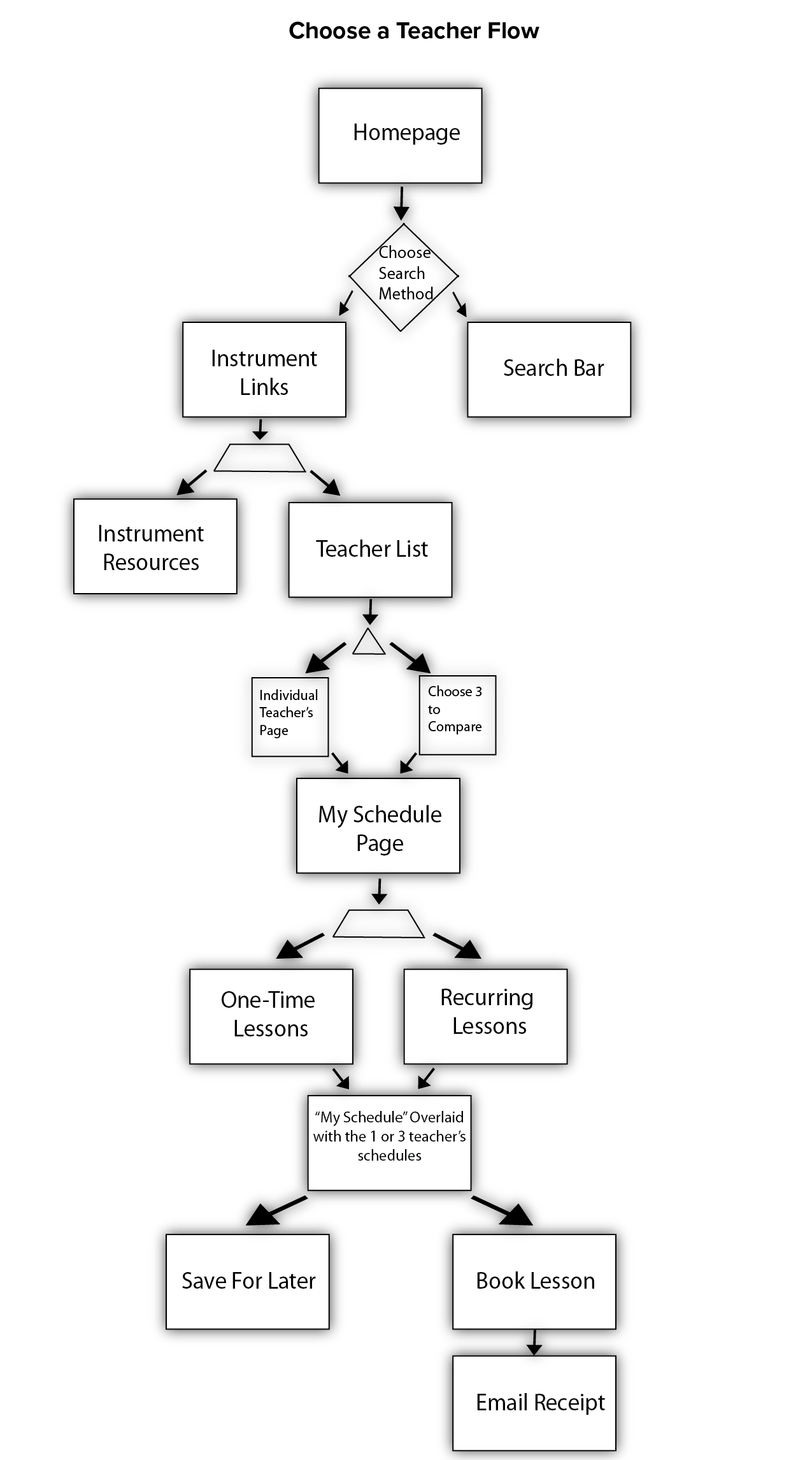
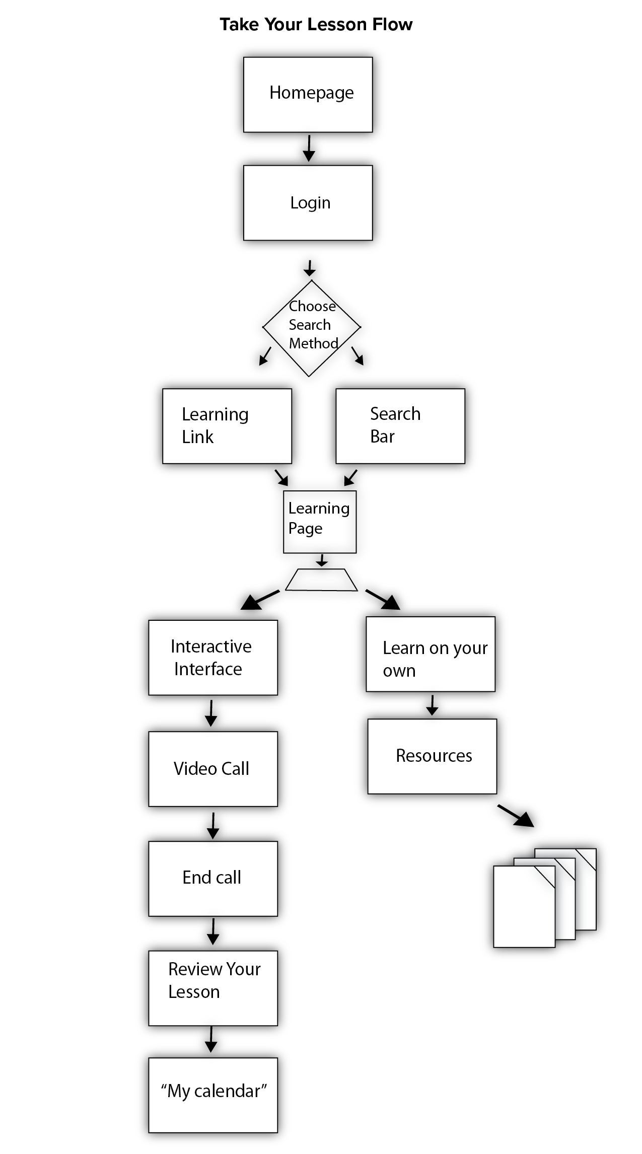
Here are two examples of processes the user might want to perform and the flow through the website they would take.


Wireframe User Flows and Prototype
This is a series of user flows represented by the wireframes created.
Click here to be taken to a live, interactive prototype of the site using these wireframes.
Style Guide
Logo
The logo was created new for this site, using sketching and mind mapping. The Lesson Spot evoked thoughts of school, learning, and writing, while also evoking images of spots, dots, circles, bulls eyes and roundness. Also learning things brings about the feeling of new, spring, fresh and pink. All of this was incorporated into the mind map:
the sketches of possible logos:
and then the final logo:
and here is the mock-up of the homepage using the style guidelines and the final logo:
Usability Testing and Research Evaluation
Usability testing sessions were conducted and this is the report.
Participants:
There were 3 participants, each used about 20-30 minutes to get through all tasks. Two represented a close fit to the Jack Daddington Persona, although one was male and one was female, and one was more like the Jill Grammar persona. They all used the internet frequently and Jack Daddington the female and Jill Grammar were familiar with online lesson taking/teaching.
Main Tasks:
Create an Account-
This was fairly straightforward for most. All three participants were able to navigate through this flow with ease and full understanding.
All three participants agreed there should be an option not to put in your age and not to have an age preference for your teacher.
Jill thought there should be an option that you don’t already play any instrument.
Jill also wanted to know if the skill level question is about the instruments you already know or the instruments you want to learn now, she didn’t’ think this was clear.
Find someone to teach you a lesson-
All three participants went smoothly straight from signing up to starting to pick a teacher.
Jill came up with a very interesting point about whether the “Teachers” tab on the nav bar is actually to pick teachers or for the teachers themselves.
Jill also wasn’t interested in the compare feature, she thought it was too much like “buying a person”.
Jill and Female Jack thought that maybe the calendar during the sign-up process was superfluous and they might rather check on the teacher’s availability before saying anything about their own, but all enjoyed the feature of overlaying the teacher’s schedule over their own.
Get to your lesson and take it-
All participants had issues finding where to take their lessons from the home page
Calling the page, “the learning spot” confused Jill Grammar as her eye read that it said the same thing as “the lesson spot”
Male Jack Daddington didn’t connect that the lessons would be there either, and kept looking in the instruments tab. He also tried to use the search bar which would have worked as well.
Female Jack Daddington was a little more able to find the spot, but it took a bit of searching and questioning out loud.
Each participant had a lot to say about the learning spot layout, including: “the time should be listed differently”, “is the chat box necessary?”, “this looks really cool”, “how do these notes appear on the screen?”, and “how does this tie into the resources page?”.
Summary of Usability Testing:
Overall the Jack Daddingtons had a lot less to say than the Jill Grammar participant. Jill was very concerned with the wording of things, but they all seemed to think your age and the teacher’s age were a touchy subject. Jill was very adamant about adding and subtracting things to the interface while the Jack Daddingtons just went along with the process. The biggest take aways were that there needs to be more places for “no answer” in all processes and that “the learning spot” area is confusing upon first glance and should be renamed to something like “Lessons” or “Take your lesson here” or “Learn” etc.
Summary
This project ran a lot smoother than expected and no huge missteps or mistakes were uncovered. For the most part, only small things needed to be tweaked based on user research, feedback and constant iteration. One bigger consideration were the titles on the search bar, including "Teachers" and "The Learning Spot". "Teachers" was left alone, because the teachers themselves will wind up having a whole separate interface, and that should take care of most of the confusion. Perhaps in the future the title will be changed, but for the time being it seems to make more sense than confusion. "The Learning Spot" however, was confusing for most participants and was changed to simply "Learning". Also, any mention of the teachers' age will be removed in future steps.
The most helpful aspect of this project was the process of creating personas and empathy maps based on real research and discussions with people. The direct tie between real people and the "fake" people really came in handy when going back to real users during the usability testing phase.
Next Steps
Fleshing out more mock-ups and creating a high-fidelity protoype with more functionality would be the next step, then running another user testing session with that prototype. Also, due to the nature of the site, the desktop version was the main consideration for this project, but another next step would be to develop a mobile or app interface that could either be used in the same way as the the site, or at least as a compliment for on the go usage.