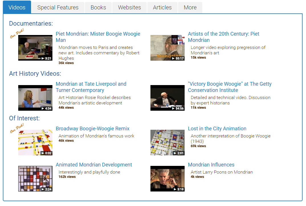
A mobile layout design for the "Key Artists" of a movement page. The client asked for a slight redesign to more reflect current UI mobile standards in use. The process took into consideration responsive design, as well as condensing the information to better suit the mobile interface, while still maintaining what the client believes are the strong points of the site. For the overall UI of the site, I designed these buttons with carrots and coloration to denote whether the tab is open or closed. For this particular page, I chose a carousel effect with a link to the details of that artist at the bottom. I also altered the colors in the Facebook and Twitter icons to be "Art Story Blue" and more square with round edges.
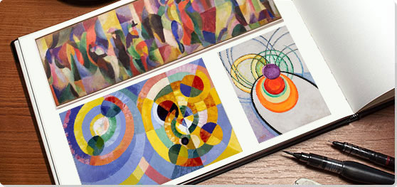
A layout from the "Orphism" movement page, displaying some of the movement's best works. Here I attempted to make the top image appear as if it was lifting slightly off the page, to get a more realistic feel of an album.
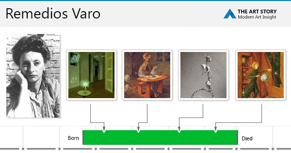
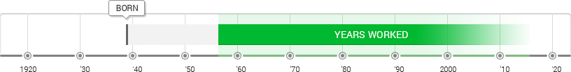
This is a "share" page for the artist Remedios Varo. These are designed to highlight the artist's work progression and to share.
A timeline of the life and work of artist William Eggleston.
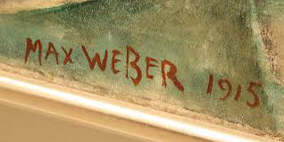
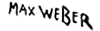
I was often tasked with pulling artist's signatures off of dedications pages or paintings like the one above and making them into transparent png's, suitable for placement on their individual artist pages. This often involves various tracing and selection techniques or even full redraws in order to get the results as seen below. Finding the balance between maintaining an artist's unique signature and making the size and clarity correct is always a challenge.